kan.i
+ competition
+ 2weeks
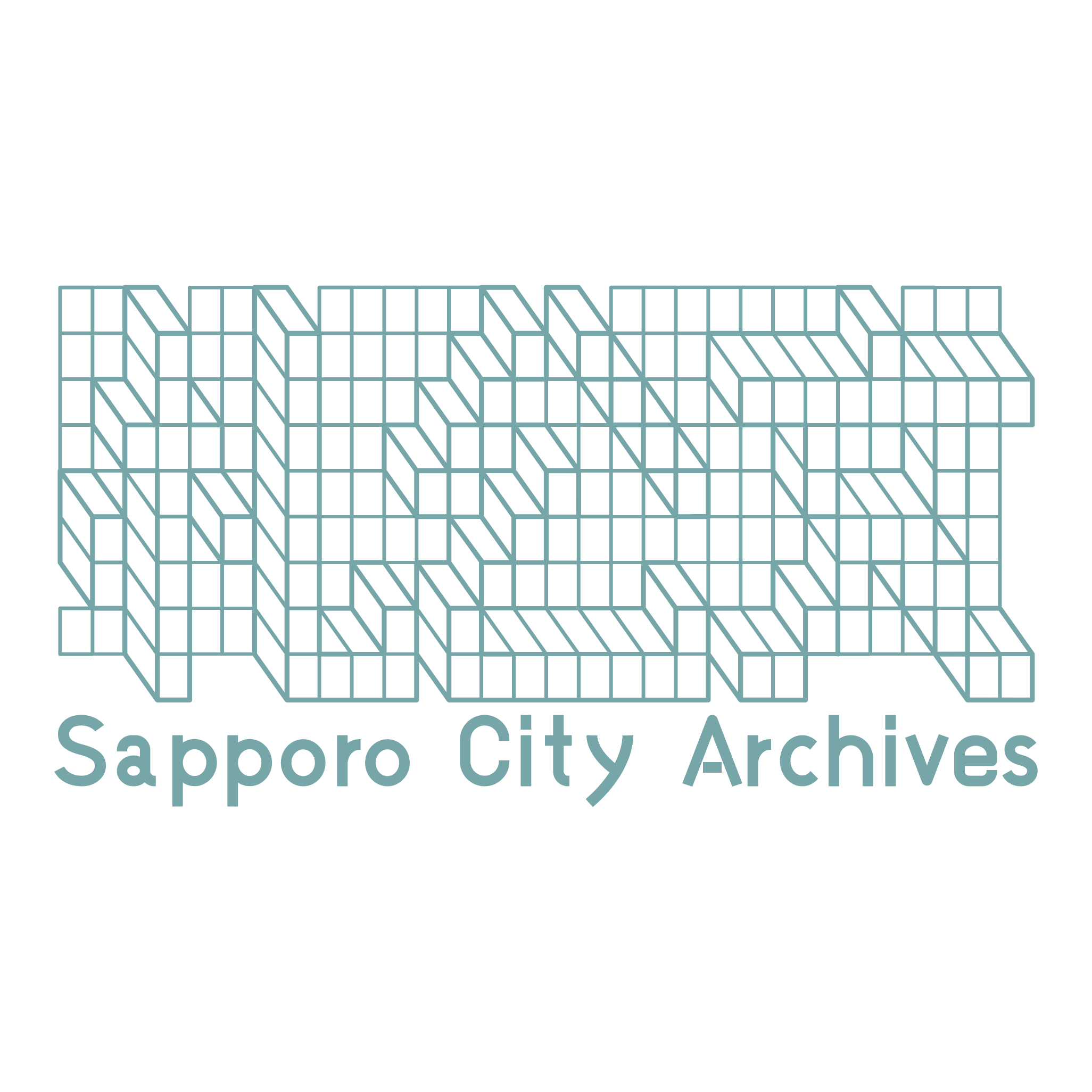
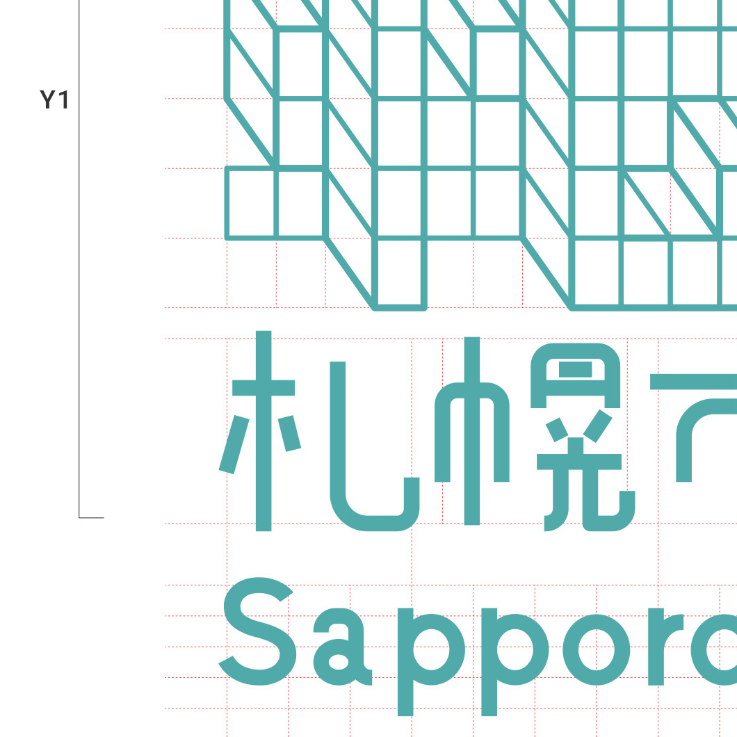
The motif of this design is the "bookshelf" of various official documents (materials) stored at the Sapporo City Archives. The use of A-size paper (A4, etc.) for official documents, both paper and data, has not changed over the years. The entire document is composed of an A-size rectangular grid. Inside the grid, the three letters of "Fuda-Komun," the abbreviation for the name of the facility, are hidden as three-dimensional objects. These letters are hidden in the hope that students and citizens will "discover for themselves the various legacies of the past" among the many official documents for research and other purposes.
-
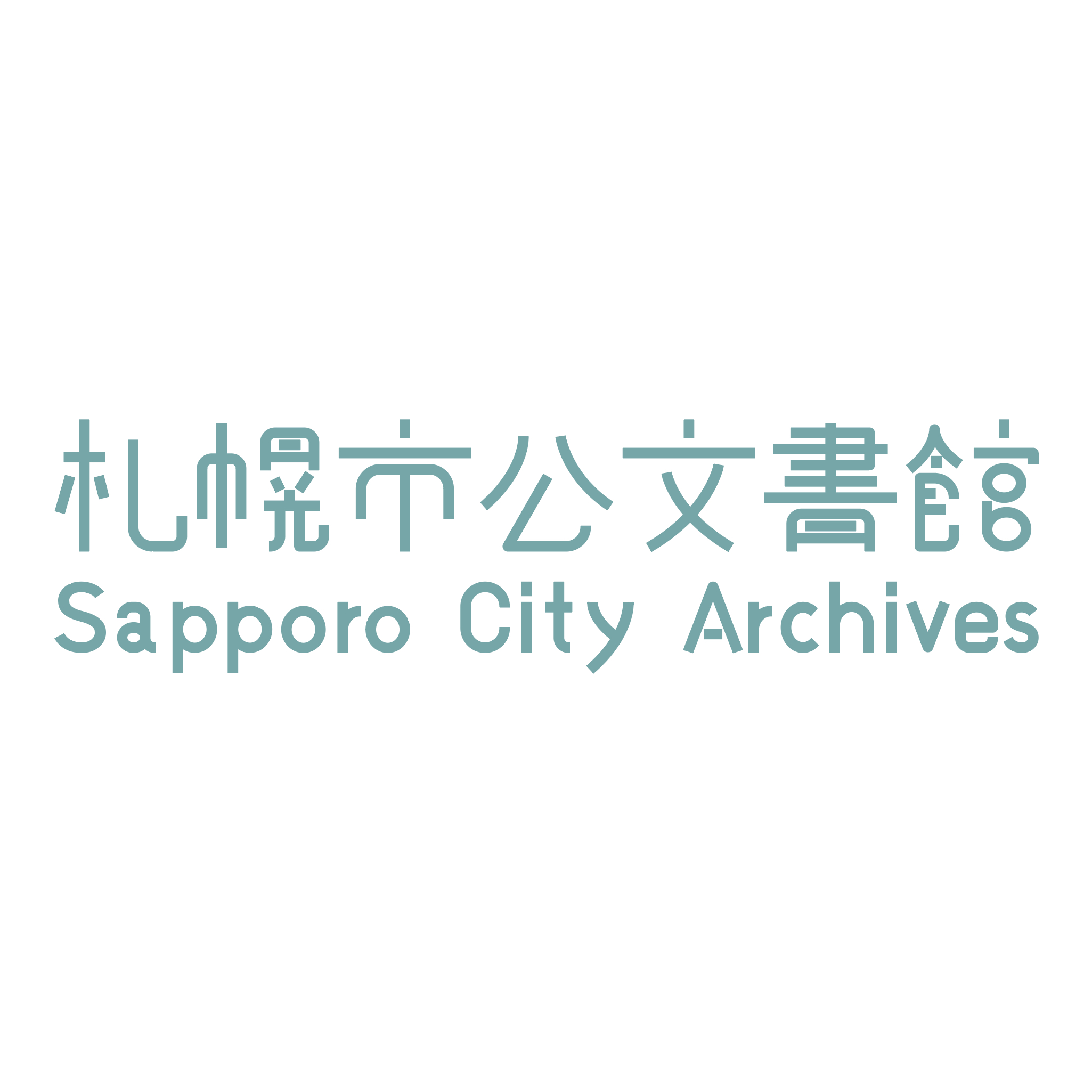
The logotype has two types of notation, Japanese and English, as an original font created from handwritten text. By paying attention to every detail in harmony with the symbol mark, we have created a design that is easy to relate to.
-
The concept color, blue-green, gives a sense of trust and is easy on the eyes. It is also a color that has a strong relationship with the city of Sapporo, as it is a mixture of the left and right colors of the Sapporo flag.
札幌市公文書館にて保管されている様々な公文書(資料)の「書庫(本棚)」をモチーフとしている。公文書の作成は紙とデータの双方で、A判(A4等)を用いるという点は昔から変わらない。全体をA判の長方形グリッドで構成し、内部には施設名称の略称である「札公文」の3文字が、立体として隠れている。これらは市民が研究等の目的で、沢山の公文書の中から「様々な過去の遺産を、自ら見つけ出してほしい」という願いを込めた隠し文字である。
-
ロゴタイプは、手書きから作成したオリジナルのフォントとして日本語と英語の2種類の表記を設けた。シンボルマークとの調和を細部まで意識することで、親しみやすいデザインとしている。
-
コンセプトカラーの青緑色は、信頼感を与えると共に目に優しい色でもある。また札幌市旗の左右色を混ぜ合わせたような色でもあり、札幌市と強い関係性を持つ色と言える。
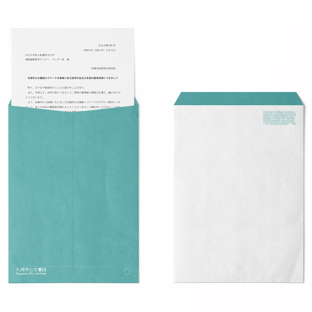
札幌市公文書館ロゴマーク(採用作品)
+ competition
+ 2weeks
The motif of this design is the "bookshelf" of various official documents (materials) stored at the Sapporo City Archives. The use of A-size paper (A4, etc.) for official documents, both paper and data, has not changed over the years. The entire document is composed of an A-size rectangular grid. Inside the grid, the three letters of "Fuda-Komun," the abbreviation for the name of the facility, are hidden as three-dimensional objects. These letters are hidden in the hope that students and citizens will "discover for themselves the various legacies of the past" among the many official documents for research and other purposes.
-
The logotype has two types of notation, Japanese and English, as an original font created from handwritten text. By paying attention to every detail in harmony with the symbol mark, we have created a design that is easy to relate to.
-
The concept color, blue-green, gives a sense of trust and is easy on the eyes. It is also a color that has a strong relationship with the city of Sapporo, as it is a mixture of the left and right colors of the Sapporo flag.
札幌市公文書館にて保管されている様々な公文書(資料)の「書庫(本棚)」をモチーフとしている。公文書の作成は紙とデータの双方で、A判(A4等)を用いるという点は昔から変わらない。全体をA判の長方形グリッドで構成し、内部には施設名称の略称である「札公文」の3文字が、立体として隠れている。これらは市民が研究等の目的で、沢山の公文書の中から「様々な過去の遺産を、自ら見つけ出してほしい」という願いを込めた隠し文字である。
-
ロゴタイプは、手書きから作成したオリジナルのフォントとして日本語と英語の2種類の表記を設けた。シンボルマークとの調和を細部まで意識することで、親しみやすいデザインとしている。
-
コンセプトカラーの青緑色は、信頼感を与えると共に目に優しい色でもある。また札幌市旗の左右色を混ぜ合わせたような色でもあり、札幌市と強い関係性を持つ色と言える。
Copyright 召 2018- kansuke ito All Rights Reserved.